Food Now: An Integrated Food Delivery App
Overview
In a graduate User Centered Design course, I worked in a team of three to prototype and test “Food Now”, an integrated food delivery application.
The User
This target user for this app is someone who not only orders delivery, but makes an effort to find the most convenient or cost-effective method of doing so.
The Problem
With the growing number of available food delivery services, it's difficult and time-consuming for users to compare their options and choose the best fit for their needs.
The Solution
By integrating the available delivery options into one application, the user will no longer need to open and switch between multiple mobile applications to gather the following information:
-
The full range of restaurants available for delivery
-
The cost of delivery for a specific order across all available delivery options
-
The estimated time of arrival for their order
My Role
My primary role in this project was to perform user research (i.e. contextual inquiries and usability testing) and data analysis to inform the designers' processes. In the initial phases of the project, I used participant data to create personas and the journey map structure.
Objectives
The system will integrate the available food delivery options to allow users to easily compare across food delivery services and order through the option that best fits their needs.
Key functions will allow users to:
-
Link their food delivery service accounts
-
Search for restaurants & cuisines
-
View & filter by categorized recommendations
-
Note favorite restaurants and menu items
-
Compare available delivery services for a specific order
-
Place an order for delivery
-
Rate their delivery & restaurant experience
Design Vision
Food Now is targeted towards people for whom delivery is the most convenient option. The vision for this app is to design for convenience and minimize the user's cognitive load.
This app aims to maximize the convenience of the food order and delivery process by:
-
Storing and auto-populating frequently needed information such as delivery instructions and payment methods
-
Consolidating delivery service options for a given order, including delivery fees, service fees, and arrival time
-
Storing the user's preferred restaurants and meals to allow users to quickly reorder their favorite food
Contextual Inquiries
To develop an understanding of the user base for this app, I conducted contextual inquiries with 6 participants who use multiple food delivery services and had ordered delivery within 30 days of recruitment.
During sessions, participants walked through their experiences ordering food delivery and demonstrated how they choose a delivery service to order from.
Key Findings
-
People order delivery because it's the most convenient option
-
People tend to remain loyal to their preferred service, which tends to be the first one they used
-
The total cost of delivery (fees + discounts) is an important factor in choosing a restaurant to order from
-
When people crave a specific food, they navigate directly to it without browsing for other options
Based on my conversations with participants, I also Identified two main themes. Participants were:
-
Interested in exploring delivery options or tryin something new
-
Familiar with available options and aware of what to order
Personas
When creating personas, I focused on the way people interact with the app as the main differentiator and applied the two main behavioral themes.
Brian: Cuisine Explorer, uses the app to explore his options prior to determining which restaurant to order from.
Mary: Determined Diner, already knows exactly what she wants, so she navigates directly to her restaurant of choice to place her order.

Click to image to enlarge.
Journey Map
I partnered with my teammates to create a journey map that tracks Brian and his girlfriend Susan's experience as they ordered delivery for their date night in.
We tracked overall positive and negative emotions as well as their hunger level. They experienced the most negative emotion while waiting for delivery, which correlates to when they were the hungriest.

Click to image to enlarge.
Sitemap
The designs were narrowed down to core navigational items:
-
Explore - Search restaurant options by category
-
Orders - View previous order activities
-
Utilities - Manage account activity or use the search bar browse and filter through items
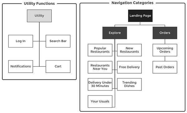
Click to image to enlarge.
Design Concepts
The prototype incorporated design concepts from existing delivery apps to leverage the users' existing mental models and familiarity with how these services work.

Click to image to enlarge.
Testing Strategy
Using the clickable prototype, I conducted usability testing with 6 participants. Each participant was tasked with (1) finding a cheap, trendy restaurant to order from and (2) rating a recent order then adding it to their favorites list
Task Measurements
-
Total time to complete the task
-
Number of errors committed per task
-
Type of errors committed per task
Test Results
Scenario 1
All 6 users completed the task with no errors
Scenario 2
5/6 users completed the task with 1+ errors, 1 user completed the task with no errors


Click each to image to enlarge.
Key Findings
Participants had no problems searching for a trendy restaurant to order from on Food Now, but had trouble locating their order history. Confusion with navigation contributed to errors in Scenario 2.
Below, I highlight the main insights from my research and my recommendations for future designs.
Insights
The Order History icon was not easily recognizable
Recommendations
Change the Order History icon to make it resonate more with users
The purpose of some navigational icons was not clear
Add labels below all navigation icons display their function
Participants expected to find info about previous orders with the restaurants they ordered from as well as on their account page
Add previous order info to restaurants where the user has ordered from in the past and on their account page
It took some time for participants to notice the "Rate Your Experience" call to action
Visually differentiate the "Rate Your Experience" CTA to draw the users' attention
Retrospective
Looking back at the overall process, I believe I had a good understanding of the userbase, their priorities, and their frustrations with existing services. However, I would have liked more time to ideate and develop solutions for our users' priorities and frustrations.